[Edit: now have a dedicated data visualisation page here.]
I’m currently learning ‘Paraview’, an open-source visualisation package for complex scientific data. Ultimately this should allow some nicely rendered visualisations in true 3D. I’m still at the early stages of learning this software and just getting data into it is quite an acheivement! I’ll stick some short movies up to chart progress as I go. Right now I’m experimenting with some model output for the Malin Shelf (western Scotland).
This clip shows a couple of tidal cycles; velocities symbolised by particle tracks and the water column is coloured by salinity, resulting in a red-blue ‘haze’ effect. Just a proof of concept really.
I’ve kept older clips created using Matlab and associated chat below. Matlab’s 3D engine and rendering capabilities are somewhat limited so I’ve been phasing out its use for this sort of thing.
————————————————————————
Physical oceanography is not the easiest science to visualise; much of the time, it’s just huge collections of numerical observations arranged into useful patterns. However, the changes over space or time often become clearer if you animate the data. The clips below show some of my experiments with animation; I’m still finding my way with the graphics and rendering of our programming software so there’s room for improvement!
This animation illustrates an experiment conducted during an oceanographic cruise to the edge of the European continental shelf (JC088, July 2013). A parcel of harmless fluorescent dye was injected at 100 m depth to track the flow of a slope current carrying warm, salty water towards the Arctic. The dye was invisible at the surface, so the only way to follow its progress was through trial and error using a fluorometer raised and lowered from the ship. The black blob and dotted line show the ship’s path as we tracked back and forth, trying not to lose the underwater dye patch. I estimated the motion of the dye (the green trail) using water speed observations from the ship to get an idea of where we might be intersecting the growing dye patch. The dye shows the overall motion of the slope current along the shelf-edge, but also the local tides, illustrated by the purple arrows.
Another experiment conducted during JC-088 at the edge of the European continental shelf. Two groups of GPS-equipped drifting floats were released from the RRS James Cook to track the progress of an oceanic current as it passed across a canyon system. Each float was fitted with a weighted drogue (underwater parachute) on a length of cable, meaning that the float tracked the movement of water at the depth determined by the cable length.
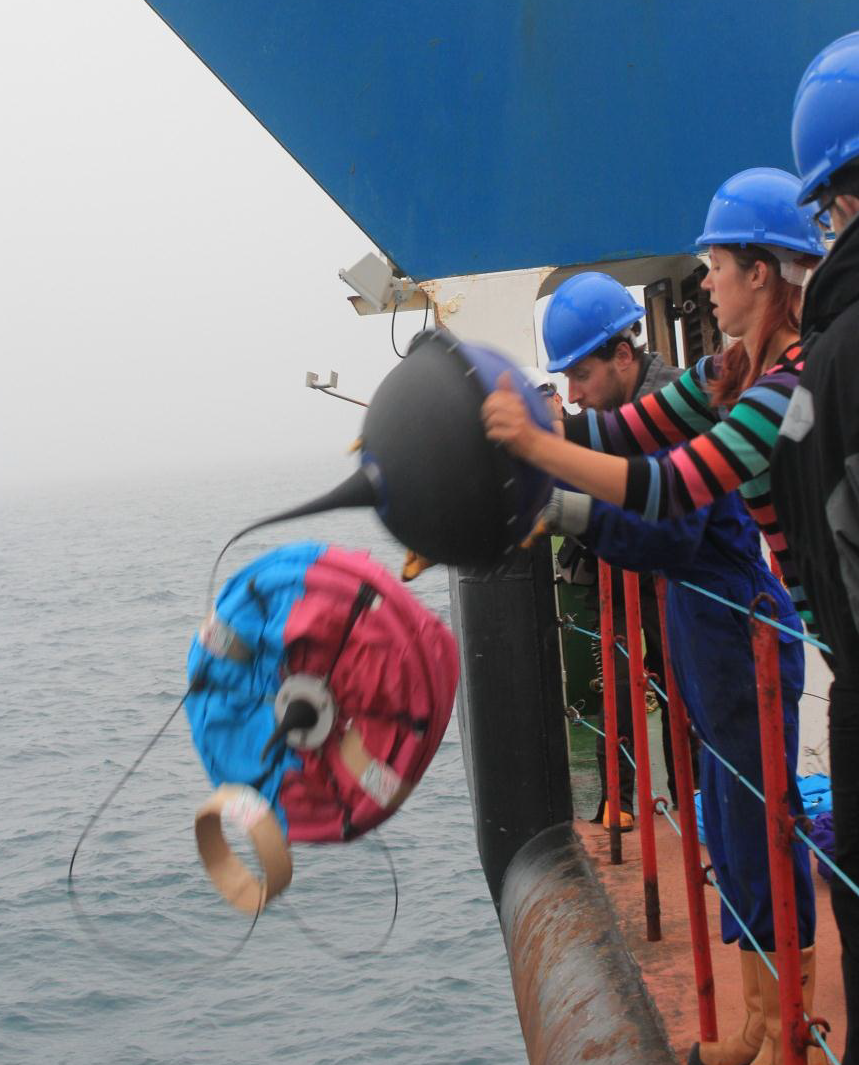
The blue floats were drogued at 15 metres so tracked the near-surface currents. The red floats were drogued at 70 metres so follow deeper currents. The animation shows an early period in the experiment: the upper layers of the current are halted by a canyon system on the edge of the continental shelf and carry oceanic water towards Scotland, while the deep layers transit the canyon and continue at 15 cm/second northwards towards the Arctic. This movie shows a region approximately 20 km in diameter, water depth varies from roughly 1500 metres (dark grey) to 150 m (pale grey). Purple arrows show wind direction and strength.
A zoomed-out view of the drifters leaving the shelf-edge and heading towards Scotland can be seen below. Some of the drifters continued to transmit for 6 months.
To put the above data in context, I’ve also included a couple of clips from the cruise these experiments were launched from.
These clips were taken a few days apart in the same corner of the North Atlantic, in the middle of summer and show the range of conditions we can expect to work in. The ship is the RRS James Cook.
